The form settings for online submission form or Campaign Management System, are designed for customers to complete during the checkout process, allowing the merchant to set up various types of forms to gather specific details required for their business.
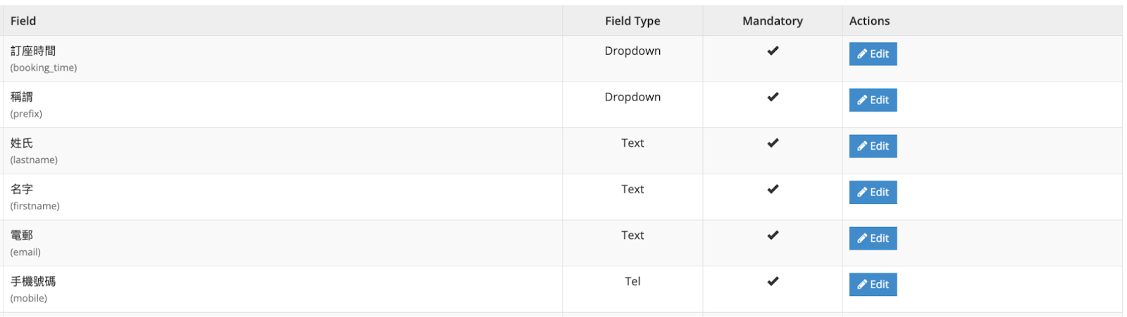
Step 1: Verify if the default mandatory custom field meets your desired requirements and preferences.
- Booking Time : Shown as a calendar during checkout.
- Prefix : A name prefix refers to a word, title, or symbol that is added to the beginning of a person’s name (e.g., Mr, Mrs, Dr.). These prefixes indicate the person’s status, profession, honorific, or other distinctive attributes. In our default field type, the prefix tab is presented as a dropdown menu for selection.
- Last Name : Last name of the customers. In our default field type, the Last Name tab is presented as a text box.
- First Name : First name of the customers. In our default field type, the First Name tab is presented as a text box.
- Email : Contact email of the customers. Customers will receive a redemption and confirmation email upon checkout. In our default field type, the Email tab is presented as a text box.
- Mobile : Mobile contact number of the customers. Customers will receive a confirmation SMS upon checkout. In our default field type, the Mobile tab is presented as a Tel box.
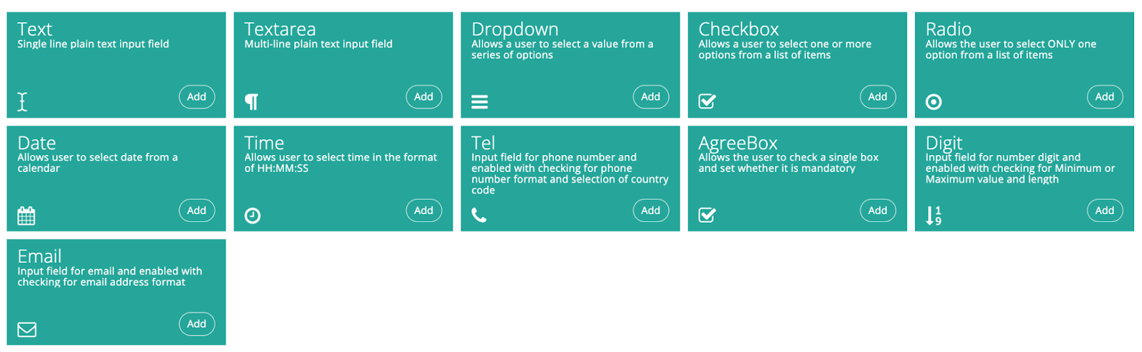
Step 2: Customise your form by clicking “+Add Custom Field” at the top right corner, adding additional fields that cater to your specific business needs, such as options for vegetarian preferences or any other requirements, if applicable.

Step 3: Choose the field type that best suits your business requirements.
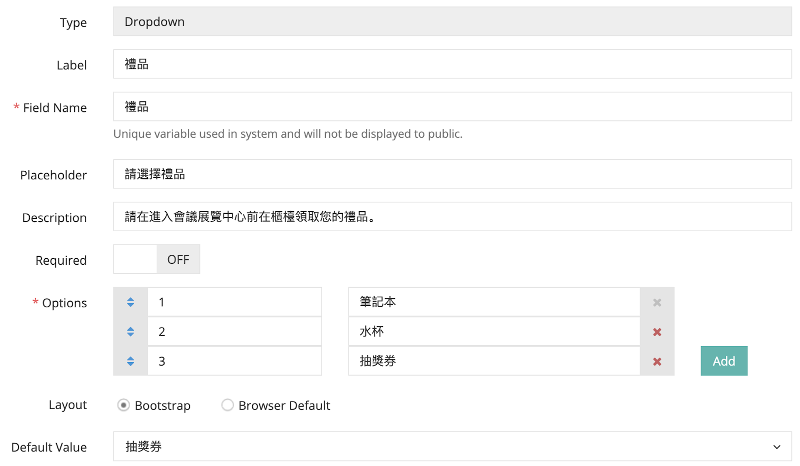
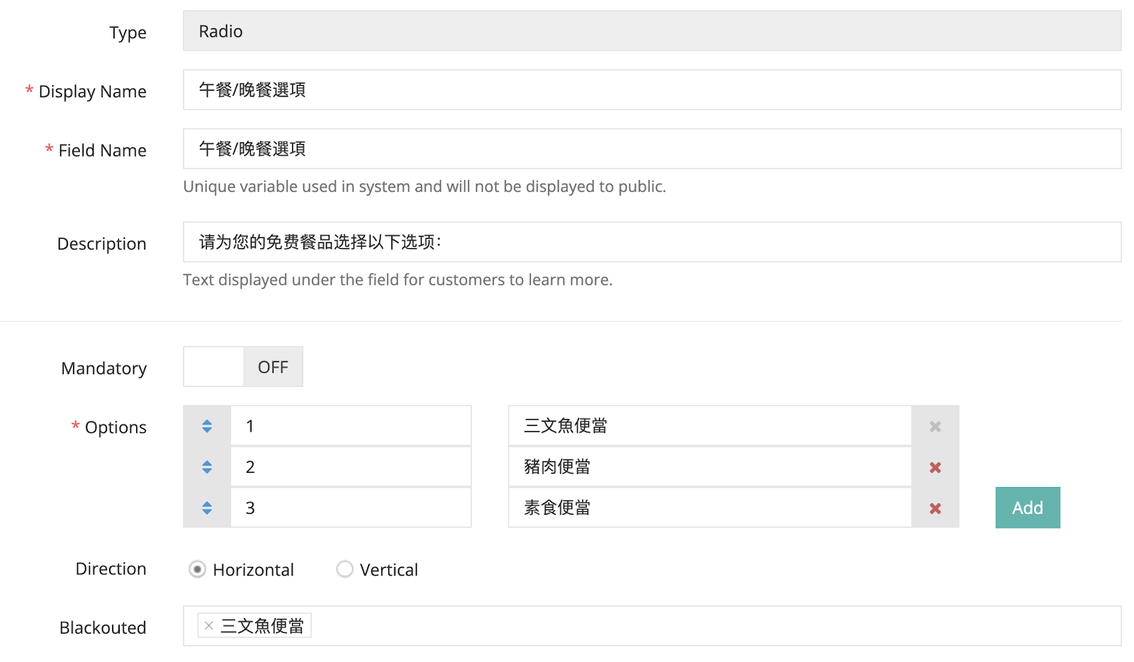
Step 4: Fill in the field settings.
Required Fields:
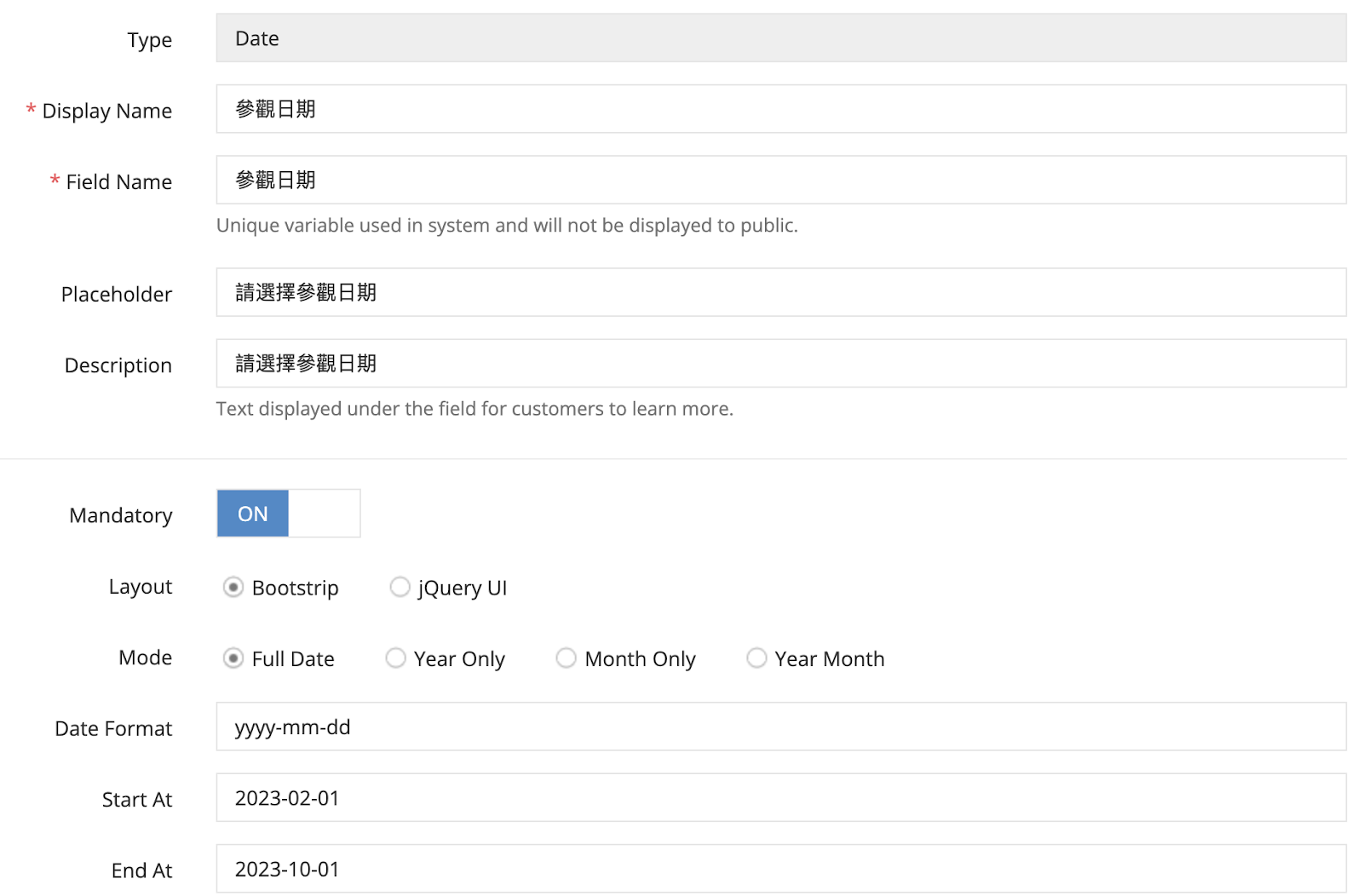
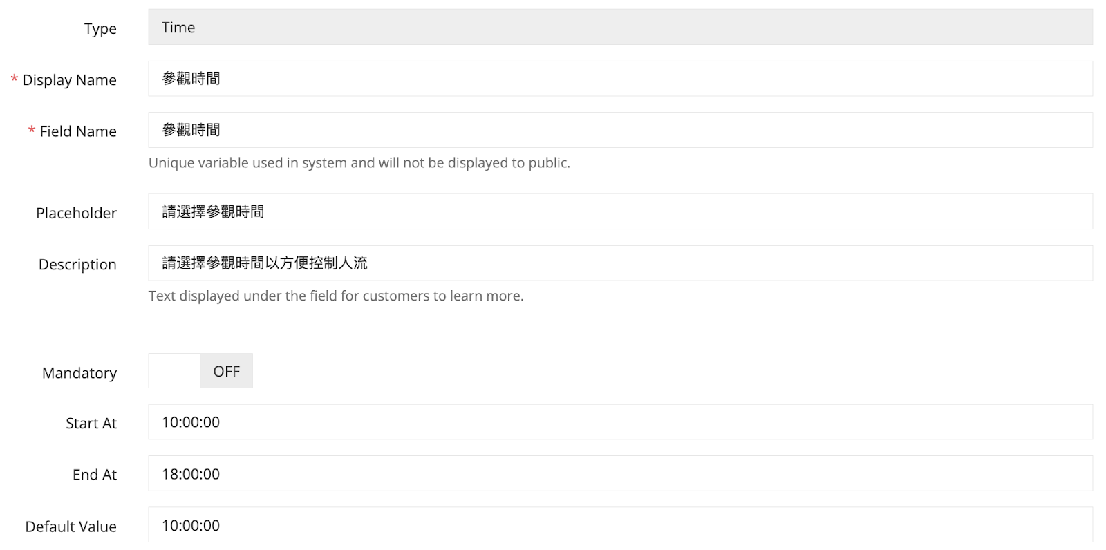
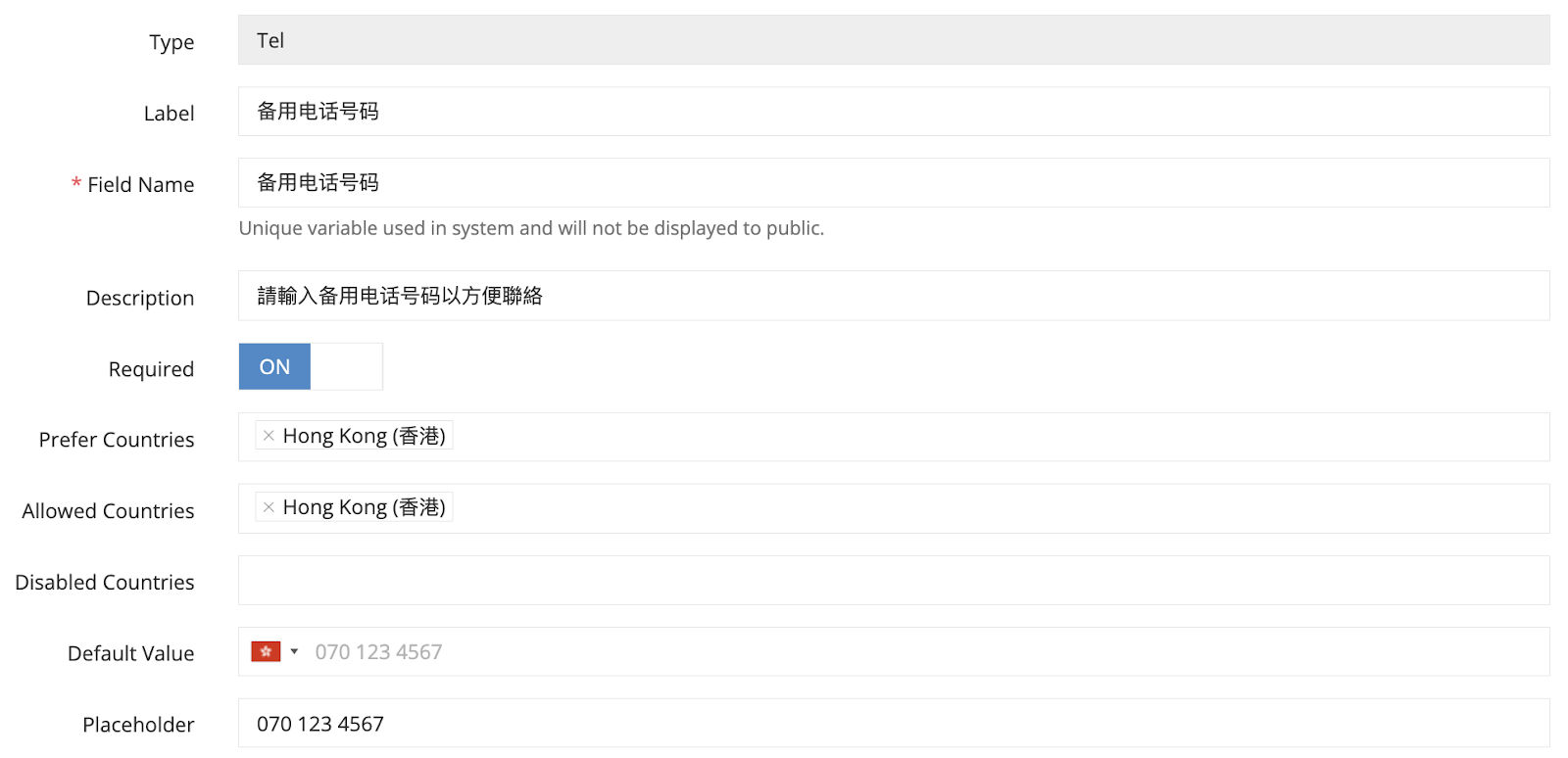
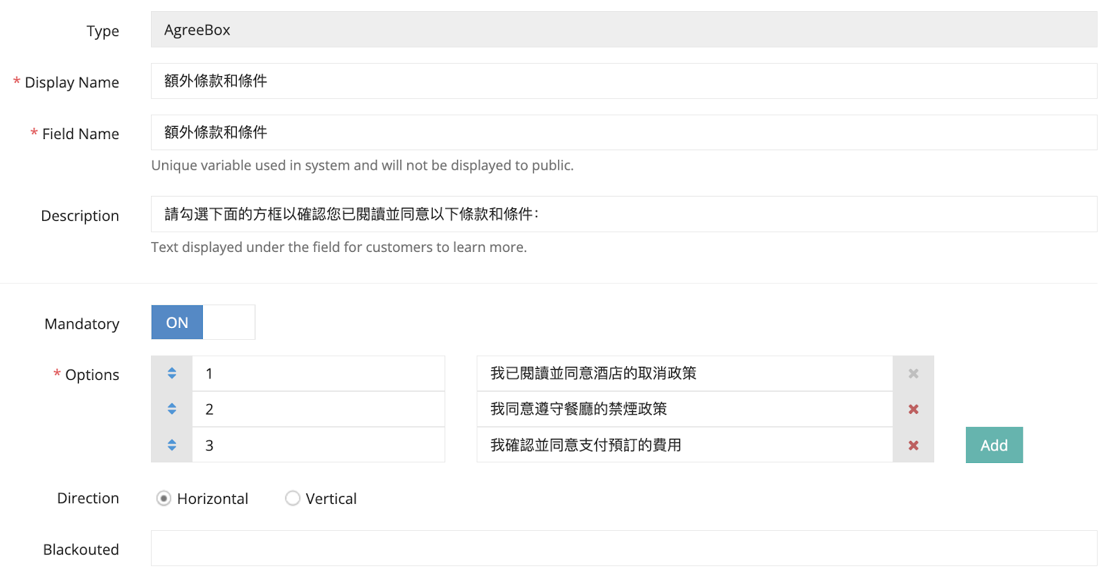
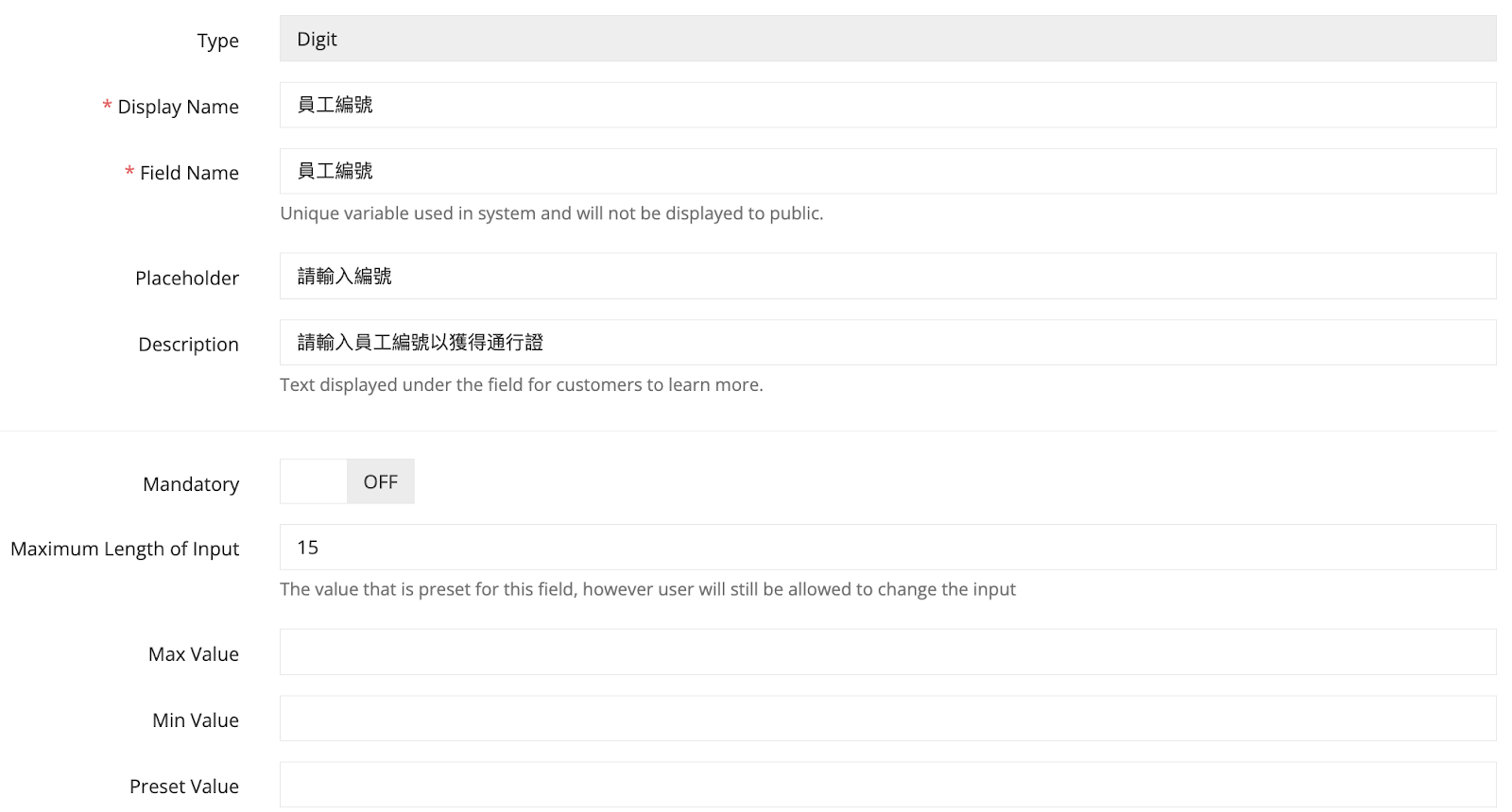
- Display Name/Label: The name that will be displayed in the actual form.
- Field Name: A unique variable used within the system and not shown to the public.
- Option: Insert the sorting numbers of options in “opt1, opt2, opt3”, then insert your selection of options in your dropdown in “Option 1, Option 2, Option 3”. You can add more options if you need. Available for Dropdown and Checkbox field type setting only.
Optional Field:
- Placeholder: A brief example or instruction provided within a text input field to guide users on the expected input.
- Description: Text displayed below the field to provide additional information or guidance to customers.
- Mandatory: Check this box if the field requires mandatory completion by the customer.
- Maximum Length of Input: The maximum number of characters or length allowed for the value/text. Insert the number of characters in numerical value.
- Preset Value: A predefined value/text that is initially displayed in the field, but users can still modify the input。
- Row: Specifies the number of rows in the text area.
- Enabled Resize?: Available for Textarea field type setting only.
- Label: Represents the title or display name of the selection.
- Required: Toggle the status to on if the field requires mandatory completion by the customer.
- Default Value: Sets a predefined value that appears initially in the field if no selections have been made for a dropdown.
- Directions: Specifies the orientation of the selections, either horizontal or vertical.
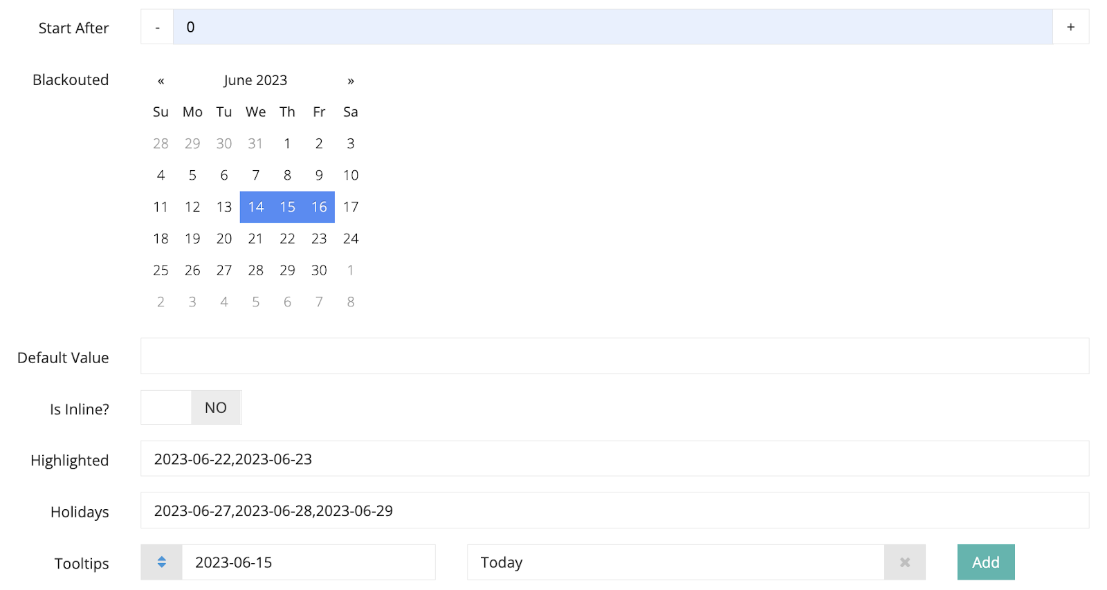
- Blackouted: Temporarily removes or disables an option.
- Layout: Option to select either Bootstrap or jQuery as the layout for your calendar.
- Mode: You can select the display mode of your calendar to show a full date, year only, month only, or day only view. Please note that only the full date calendar allows you to choose blackout dates.
- Is Inline?: Toggle the status to “ON” to show the whole calendar during date selection. If the status is “OFF”, the calendar will minimise.
- Highlighted Date: The selected date will be highlighted.
- Holiday: The selected holiday/date will be in red.
- Tooltips: You
- Sort order: Determine the order in which this section will appear in the backend system or frontend.
- Start At: Specifies the starting time or date.
- End At: Specifies the ending time or date.
- Preferred Countries: The selected countries will be displayed at the top of the country selection in the actual form for contact numbers.
- Allowed Countries: Specifies the countries that are permitted for inputting contact numbers. Leave this field blank to allow all selections.
- Disabled Countries: Specifies the countries that are not allowed for inputting contact numbers.
- Min Value: The minimum value of a digit.
- Max Value: The maximum value of a digit.
For Text:

For Textarea:

For Dropdown:
For Checkbox:

For Radio:
For Date:
For Time:
For Tel:
For AgreeBox:
For Digit:
For Email:

Step 5: Toggle the status to “ON” to activate the form field.

Step 6: Click on the “Save” button to save your field input’s settings.